Sustainability
on board
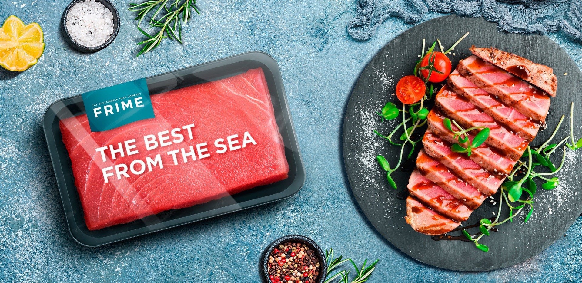
FRIME, an established but not-well-known B2B company in the fishing sector, tasked us with improving its brand positioning and providing it with an identity focused on solid messaging around sustainability.
Given this objective, we defined the brand values, personality, and tone and we told a story of ethics and respect for the seas leading to top-quality tuna. We used the tagline “The Sustainable Tuna Company”.
- Art Direction
- Logo
- Packaging
- Rebranding
- Webpage
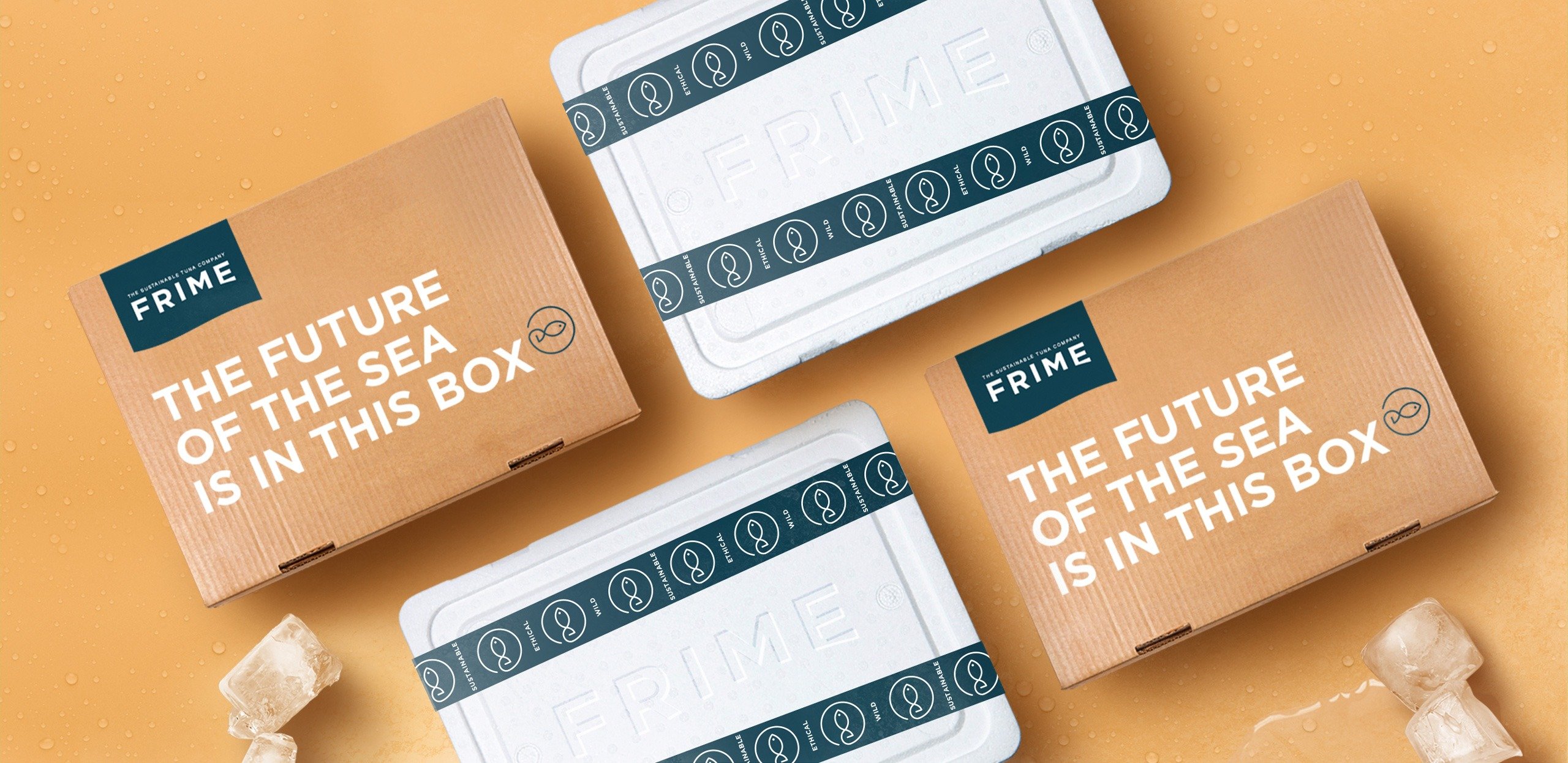

Fresh and transparent
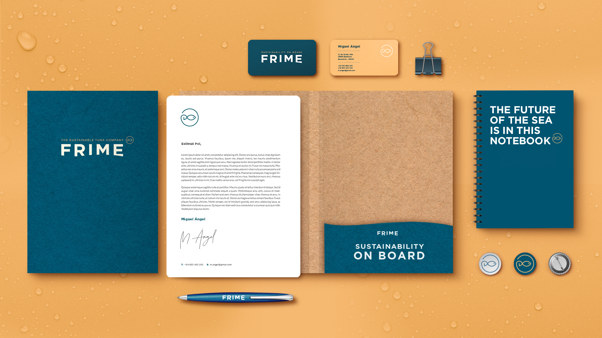
We built a new visual identity to convey the image of a modern, innovative, and professional company operating worldwide.
We developed a fresh graphical style—unique in this sector—based on blue and yellow to suggest the sea and the flagship product, yellowfin tuna. And we communicated the company’s transparency and ethical commitments with a simple and very visual system of pictograms.
Packaging that communicates
respect and quality
