Changes that
don't cause headaches
Sometimes change is the only way to stay in first place. In 2014, the leading acetaminophen (paracetamol) company went from being the only brand of this analgesic to competing with the entire generic and non-generic market. It therefore brought out a strategy to modernize and distinguish itself, expanding its range of products and redefining its communication.
Our challenge was to modernize the brand without losing its identity. We redesigned its logo and packaging and we proposed a brand framework that would provide space for expanding in new directions.
- Brand Architecture
- Packaging
- Rebranding

The modernizing
of a classic
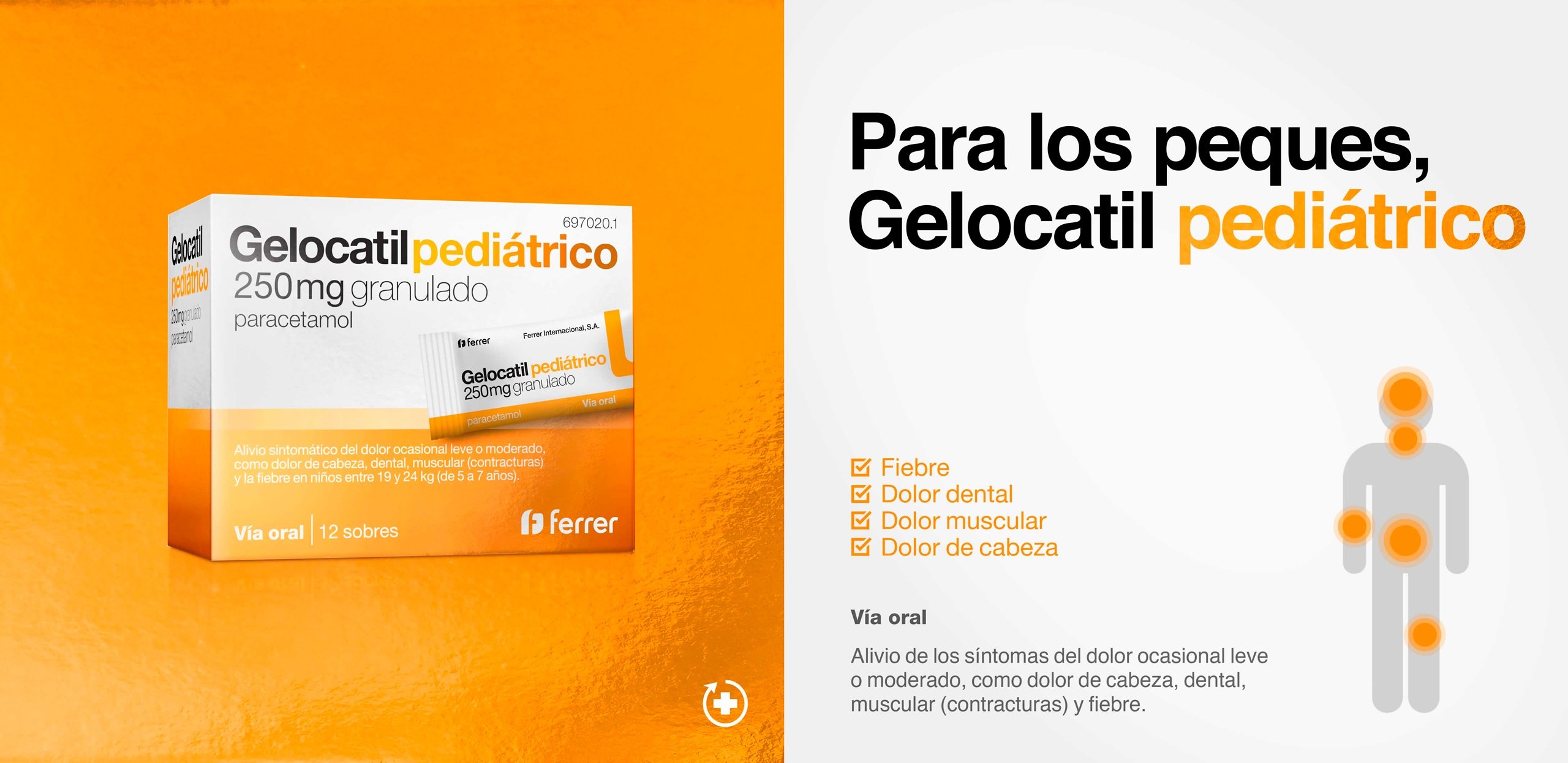
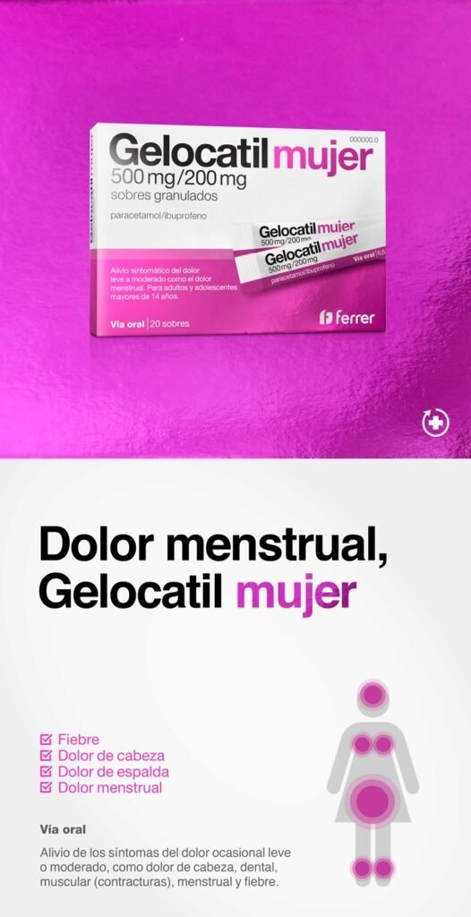
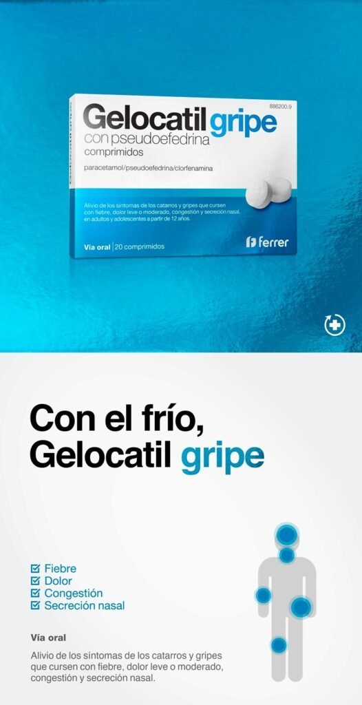
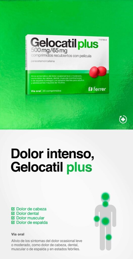
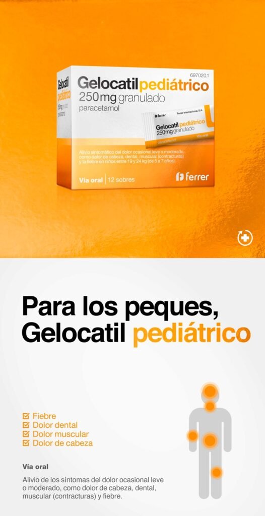
We updated the brand while maintaining its essence. We renewed the logo for readability and presence while adding metallic highlighting on its corporate red color. Finally, we redefined the framework for clear, clean, and orderly consumer-facing.

Distinctive and direct
We increased the color impact of the packaging by reimagining the iconic line of the original design and we incorporated the visual representation of that format into a consumer-facing design structure that distinguished the information in two blocks. The result is a product range that is easy to understand at a glance with a clear graphical vocabulary and a vibrant palette that stand out in the sector.
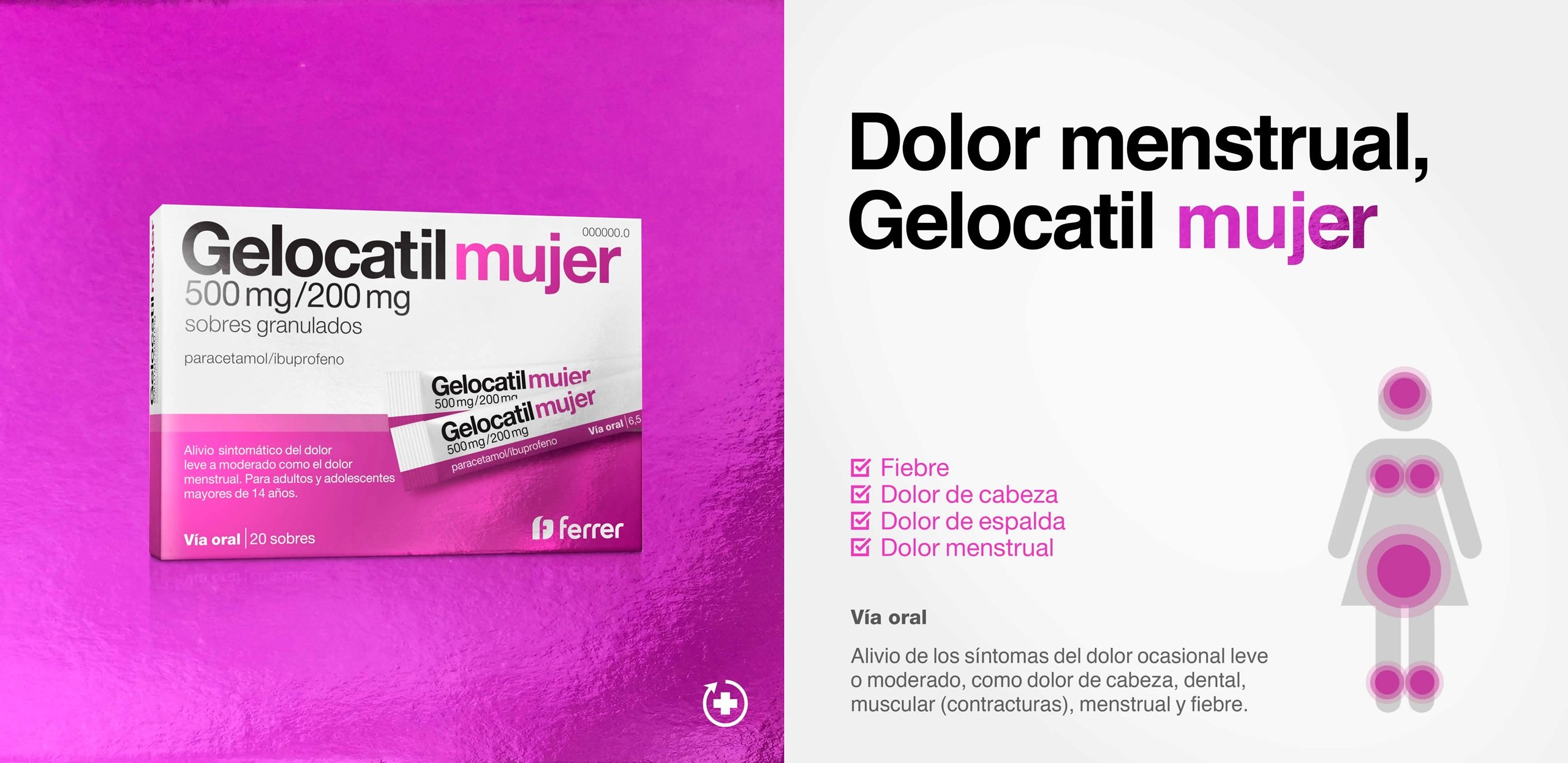
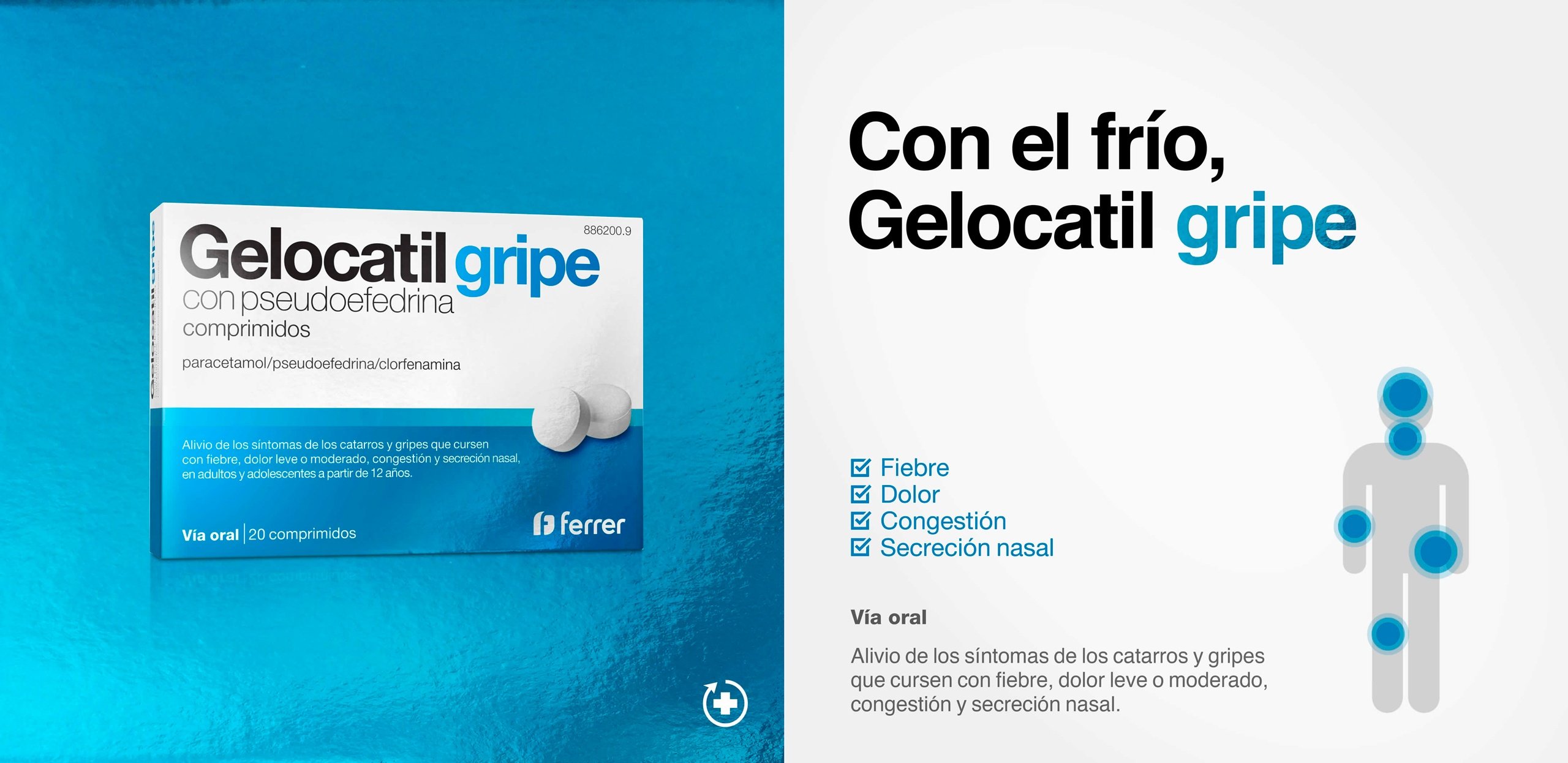
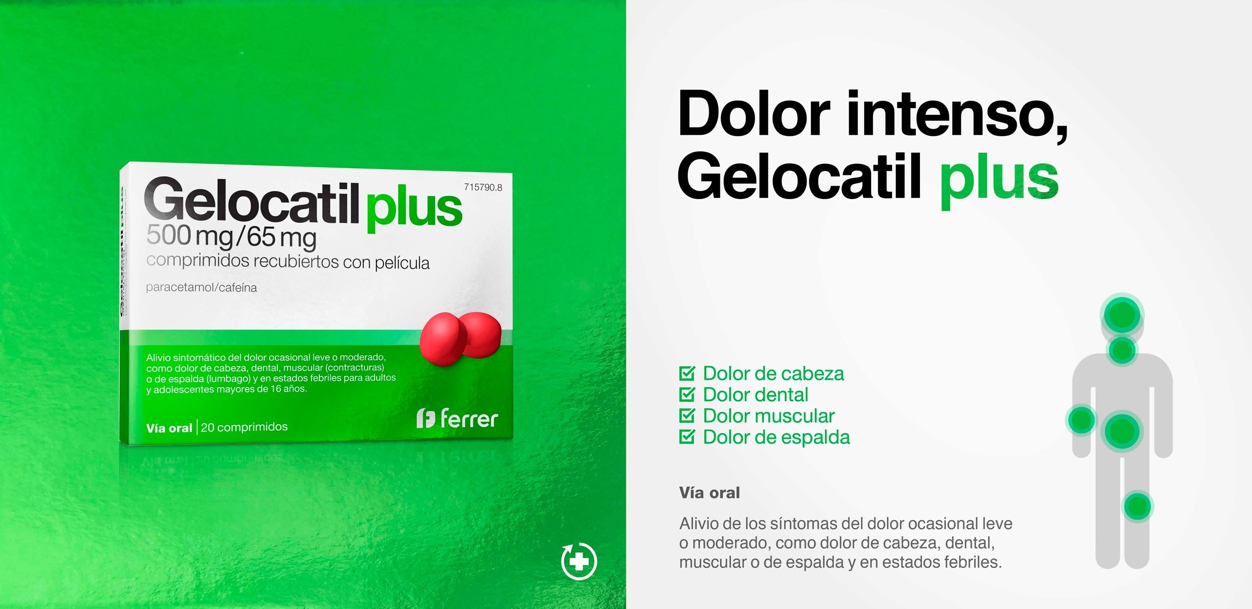
A color for
each type of pain
We positioned Gelocatil as the brand that is specialized in quick relief of different types of pain, providing a flexible framework that would allow for new segmenting of the portfolio. We set up easy-to-remember naming and a distinctive color for each of the lines.
")