An experience
for the senses
Dove asked us to redesign a range of products to transform daily self-care into an elevated well-being experience. With a sensory approach and benefits that go beyond mere functionality, the range responds to the post-pandemic trend of home self-care.
Tasked with conveying a sense of balance between sensoriality, color and a premium feel, we designed packaging and created delicate illustrations, in harmony with the essence of the brand, in which the color white and softness are key.
- Dove
- Art Direction
- Digital Campaign
- Packaging

Balance between
softness and sensoriality
Dove represents softness and fluidity, which is why circles and curved shapes are the basis of its design. We adhered to a clean structure with pure and simple geometry in which the main ingredient wraps itself around the central circle, thus conveying the concept of care.
The final result is a white bottle, the brand’s identity, with a focal point of color and vitality.

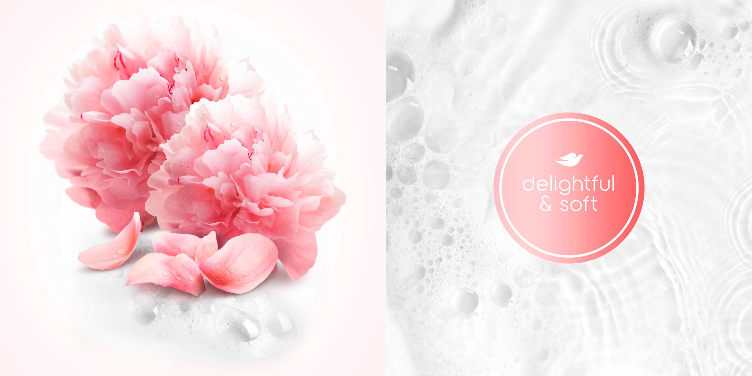
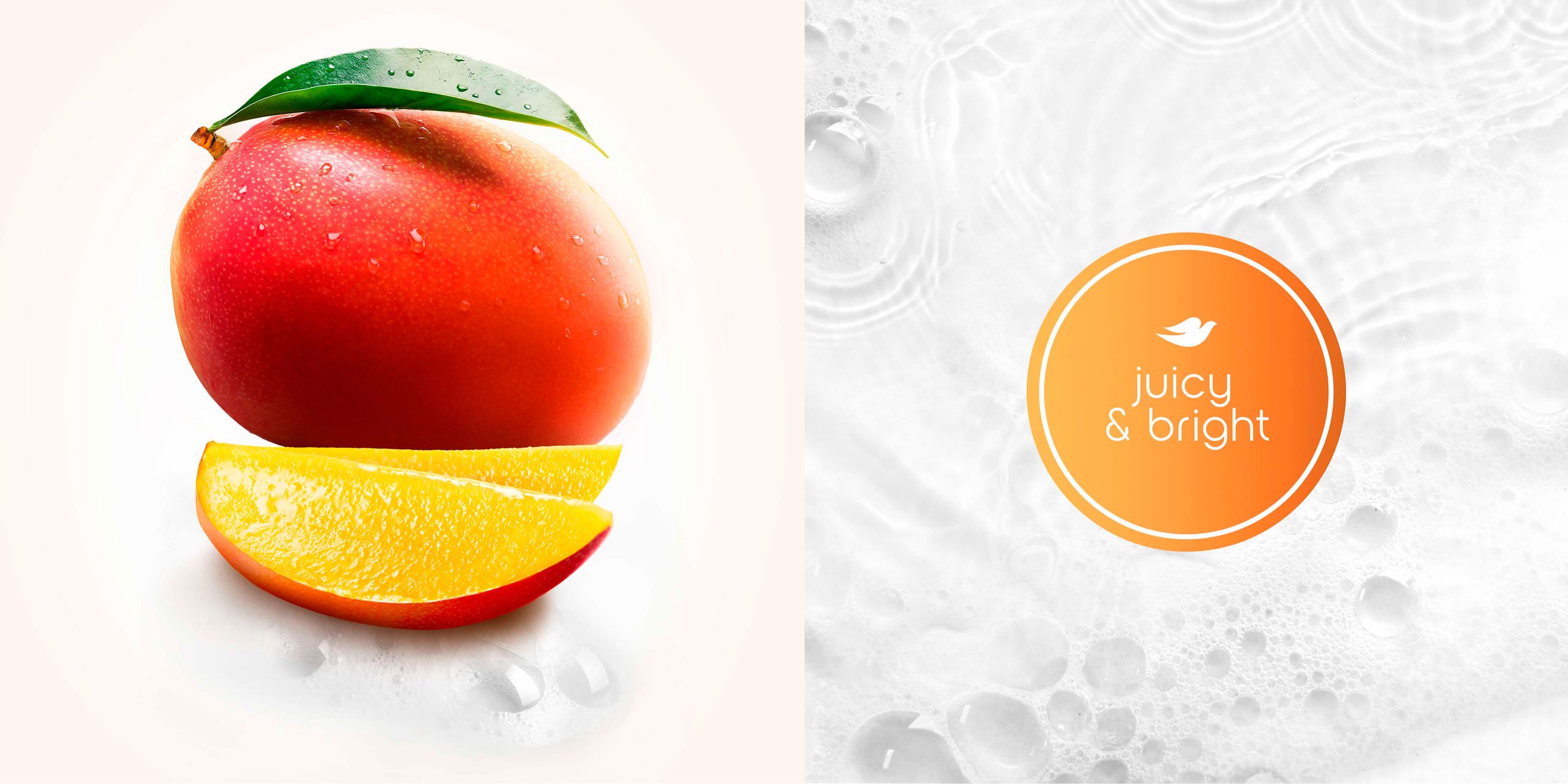
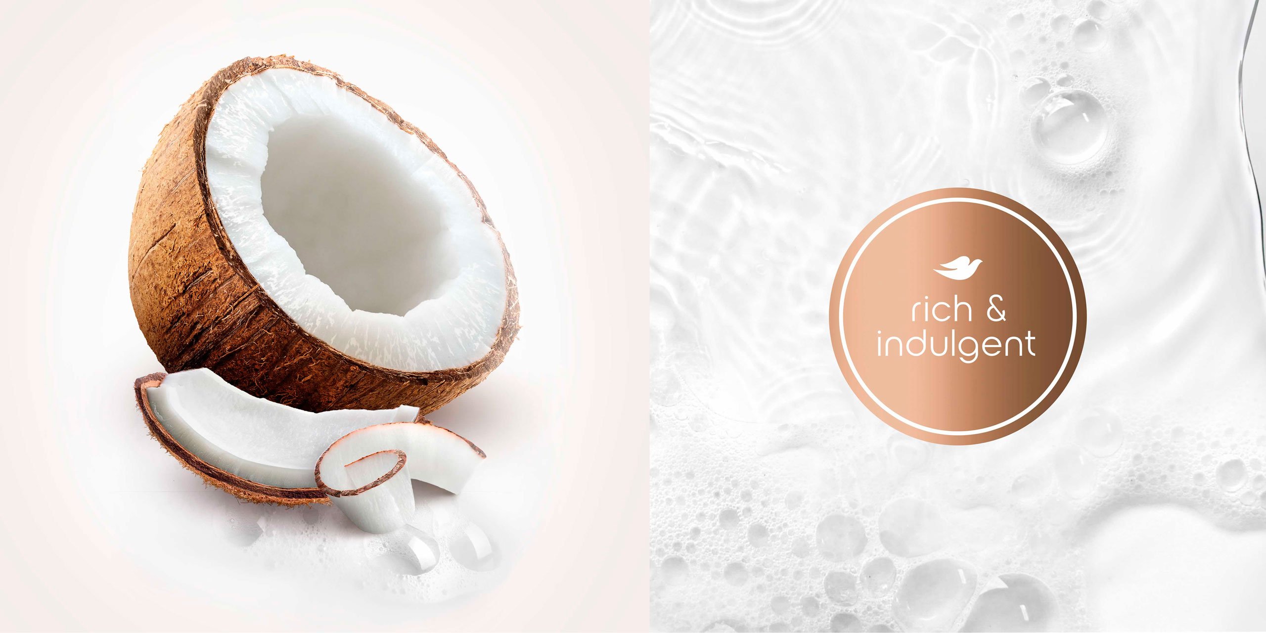
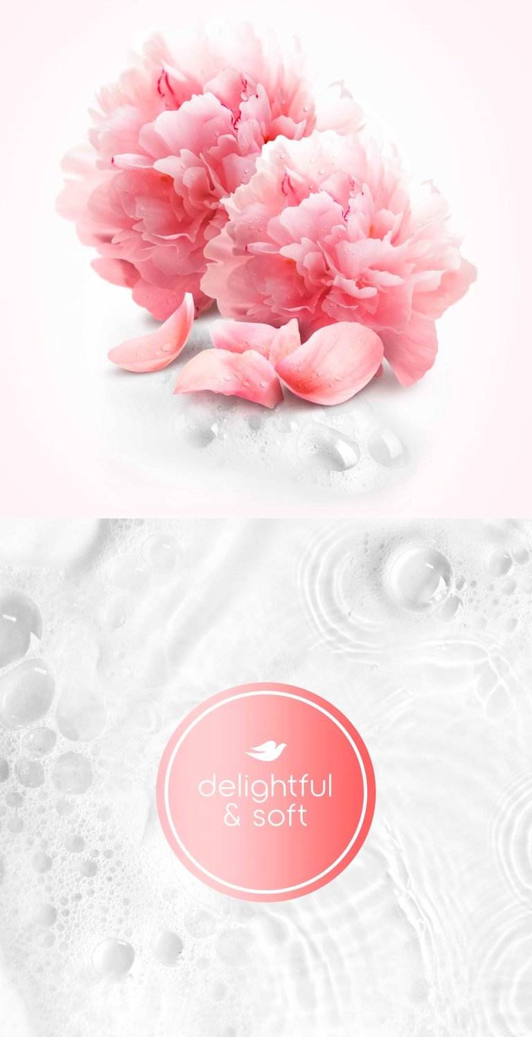
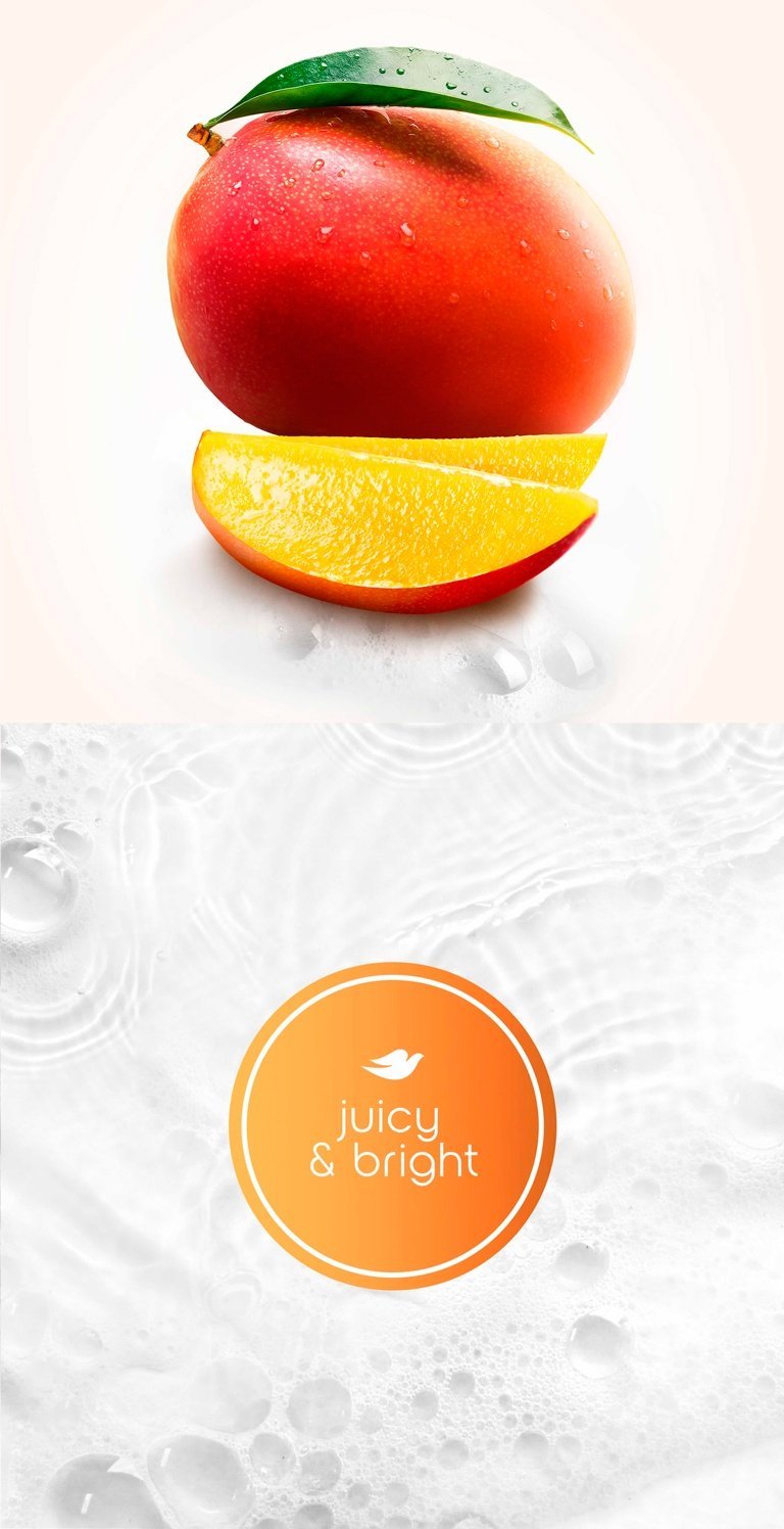
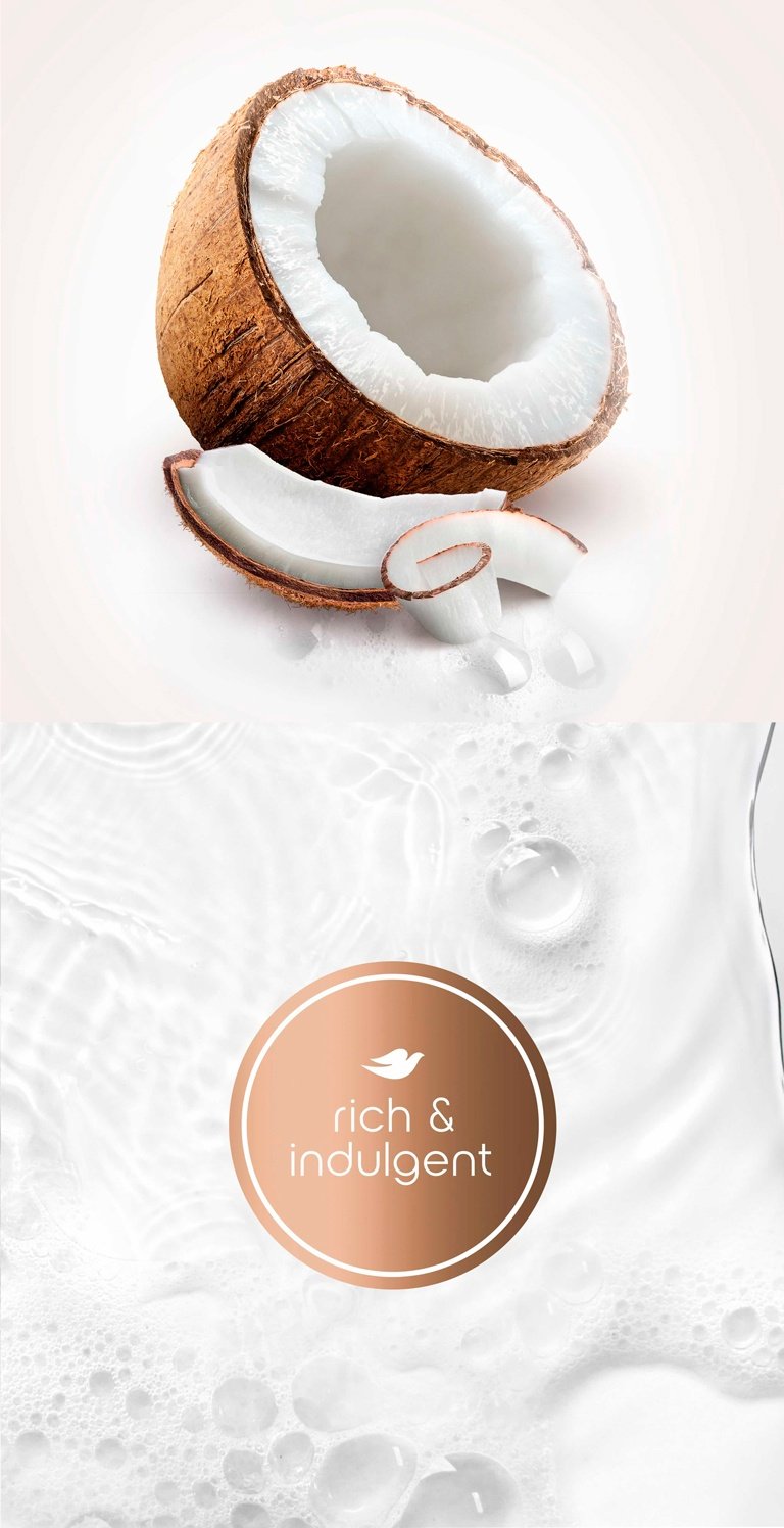
A feast
for the senses
The main ingredient is the star of the show; to celebrate it and convey its abundance, sensoriality and aromatic power, we employed a beautiful photographic effect featuring vivid colors enveloped by light, in an array of different shades. An intense burst of color and life in a delightful, pleasing bubble bath.
A special range
for each unique moment
By using a striking color code, we reinforced the difference between the four ranges and, through highly-sensory visuals, we strengthened the concept of an elevated well-being experience for each moment that is suitable for gifting.