A Fresh Approach
to Seafood
GRAND KRUST, the B2C brand of the iconic seafood company KRUSTAGROUP, entrusted us with the redesign of their visual identity to increase awareness among a younger target audience. With this objective in mind, we redefined the brand’s personality and tone of voice, emphasizing the ease of preparing gourmet dishes with seafood. Our aim was to break free from the product’s perceived seasonality, making it more accessible to a broader, everyday consumer.
- Grand Krust
- Art Direction
- Logo
- Packaging
- Rebranding
- Social Media

Tradition Meets
Modern Times
We built a new visual identity by blending Grand Krust’s essence with contemporary elements. This new approach, captured in the tagline ‘Experts in Eating Well’, highlights the brand’s know-how, adaptability and close relationship with consumers.
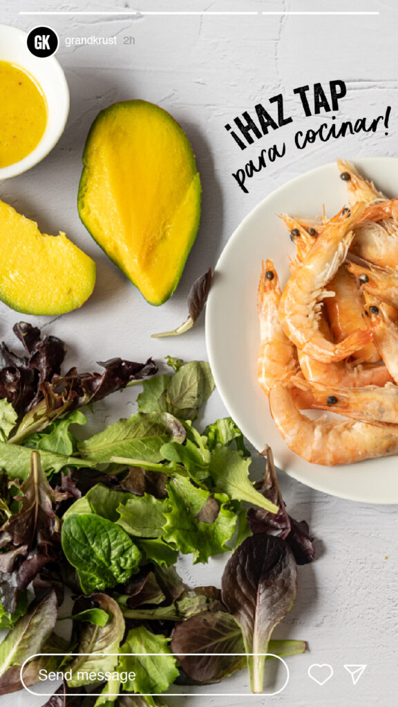
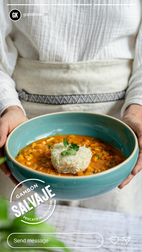
We led the art direction and implementation of educational content, including step-by-step guides for cooking each product and easy recipe ideas, providing consumers with the knowledge and skills to fully enjoy seafood.

Expertise & Innovation
on Deck
The brand’s primary font and main colors, black and white, convey the brand’s gourmet expertise. In contrast, the script font and vibrant blue add freshness and position the brand well within its market sector.
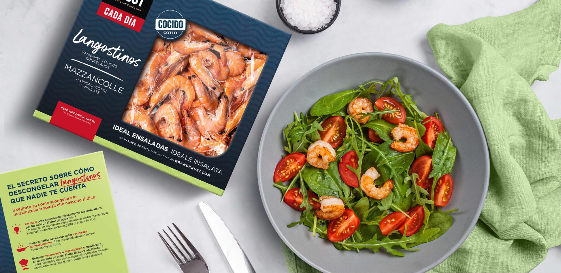
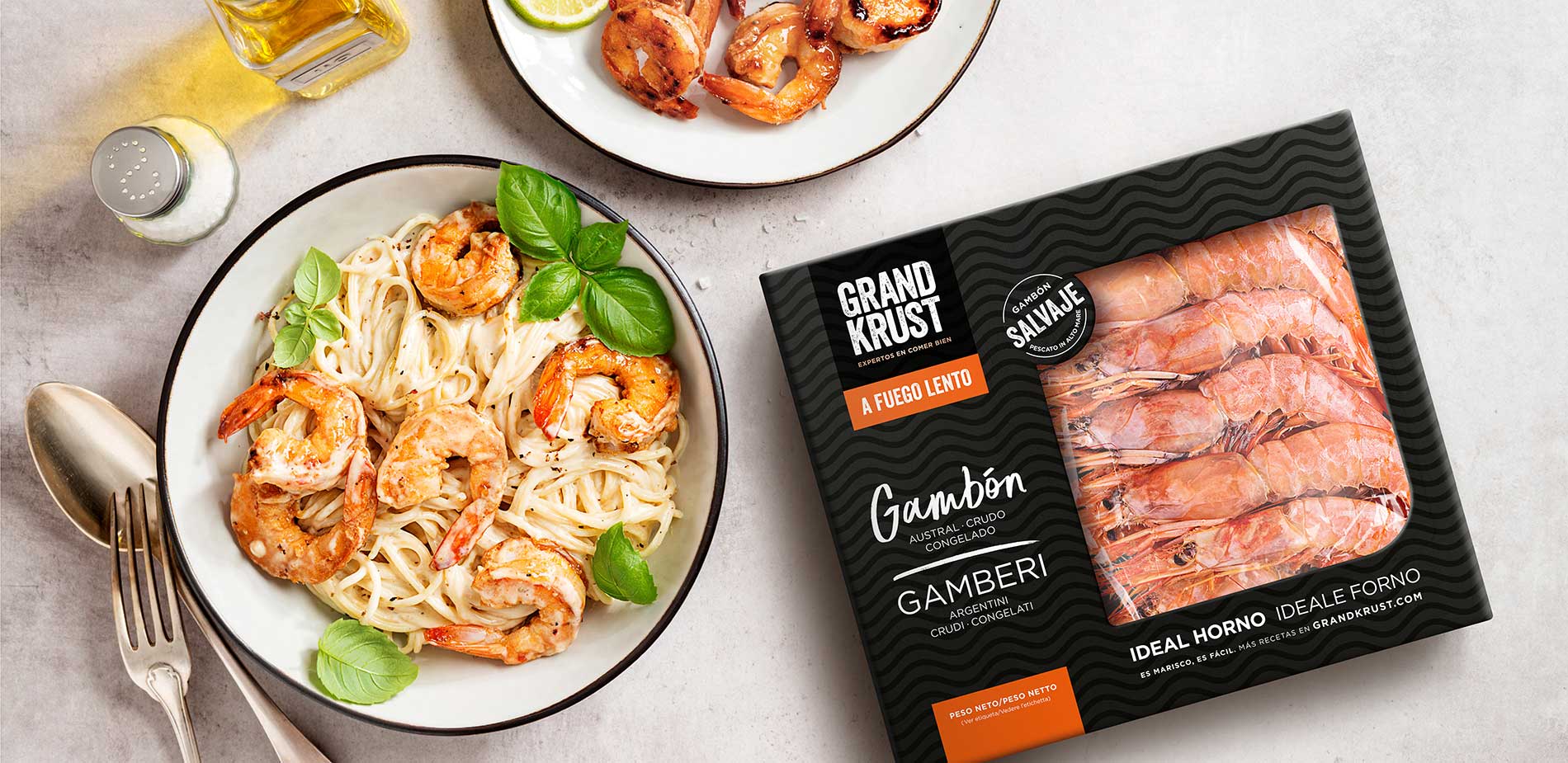
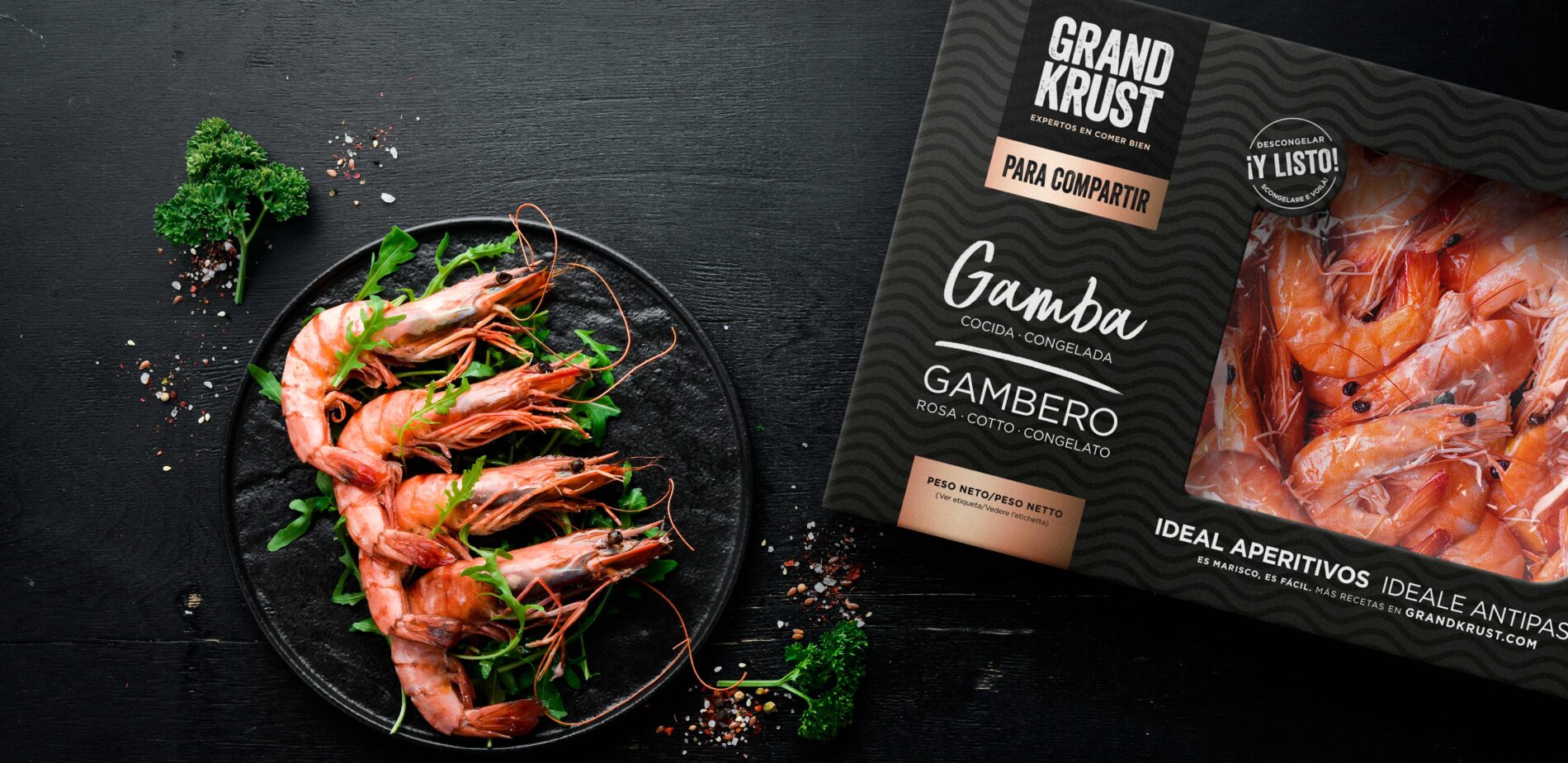
The design of the packaging stands out in the seafood section, where the product shares the spotlight with the brand’s visual identity. To enhance the brand’s appeal, we ensured that the wave pattern, typography, and block logotype are easily recognizable.
Navigating Through Variety
We repositioned the brand’s product portfolio to cater to a broader audience and various consumption moments.
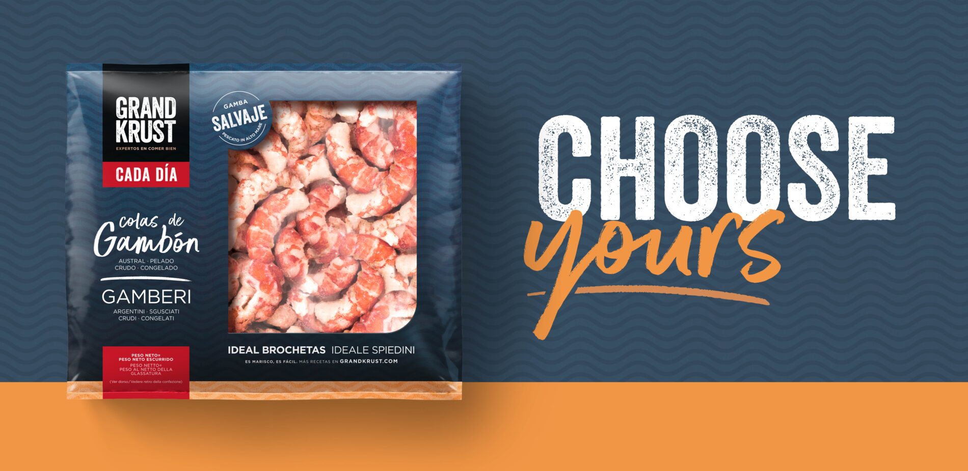
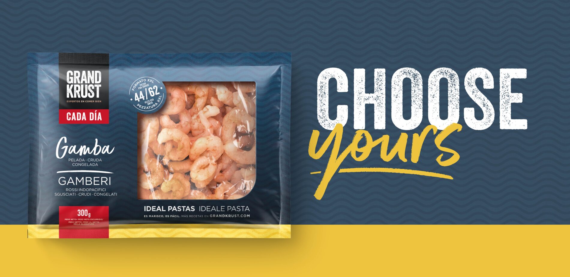
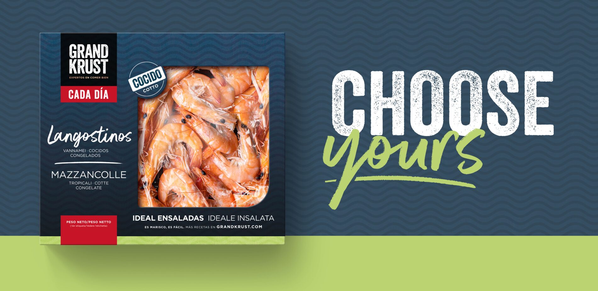
We used color to help consumers differentiate between products across three categories, which are classified according to their ideal moment of consumption.
The “daily meals” category has vibrant colors to convey a youthful and fresh appearance. The new visual identity really stands out in this category.
The ‘slow cooking’ and ‘for sharing’ variants uphold Grand Krust’s classic aesthetic. Intended for special occasions, these lines feature a black color scheme and a more toned-down composition to enhance their premium value.
Creating an online
Community
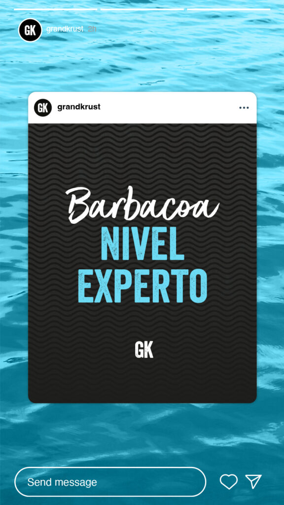
To engage with the brand’s new and younger audience, we developed a dynamic social media strategy filled with captivating Instagram stories, easy-to-make recipes, useful how-to guides and tips. This approach not only keeps the audience entertained but also embodies the brand’s expert and helpful tone. In addition to the strategy, we created and designed specific campaigns and implemented paid activations to promote and position GRAND KRUST’s new social media channel.