Revamping the
cleansing range
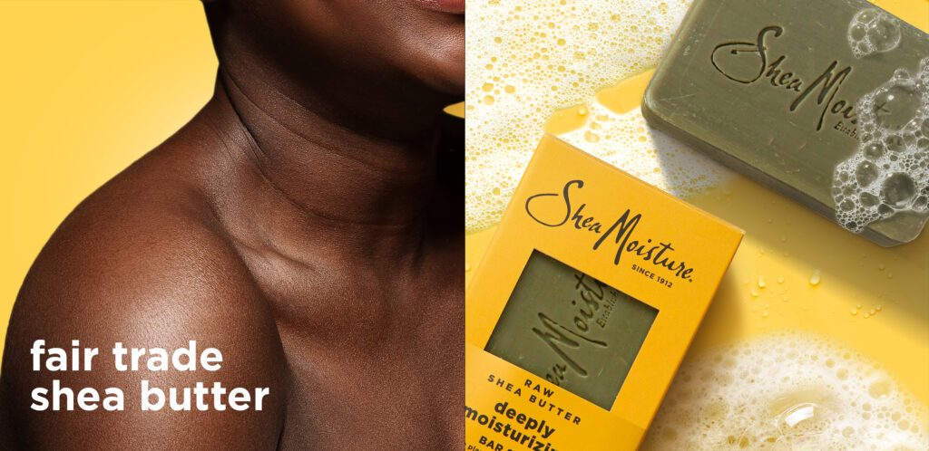
Shea Moisture is a leading global beauty brand born in 1912. Its legacy is built on formulas made with ethically sourced natural ingredients, tailored to honour textured hair and melanin rich skin.
To elevate the brand and position it as the go-to name when it comes to natural beauty, Shea Moisture set out to refresh its entire skin cleansing range—including body washes, scrubs, and soap bars— and they chose us as the reliable partner to bring this premium positioning to life.
- Shea Moisture
- Art Direction
- Packaging
- Rebranding
- Social Media

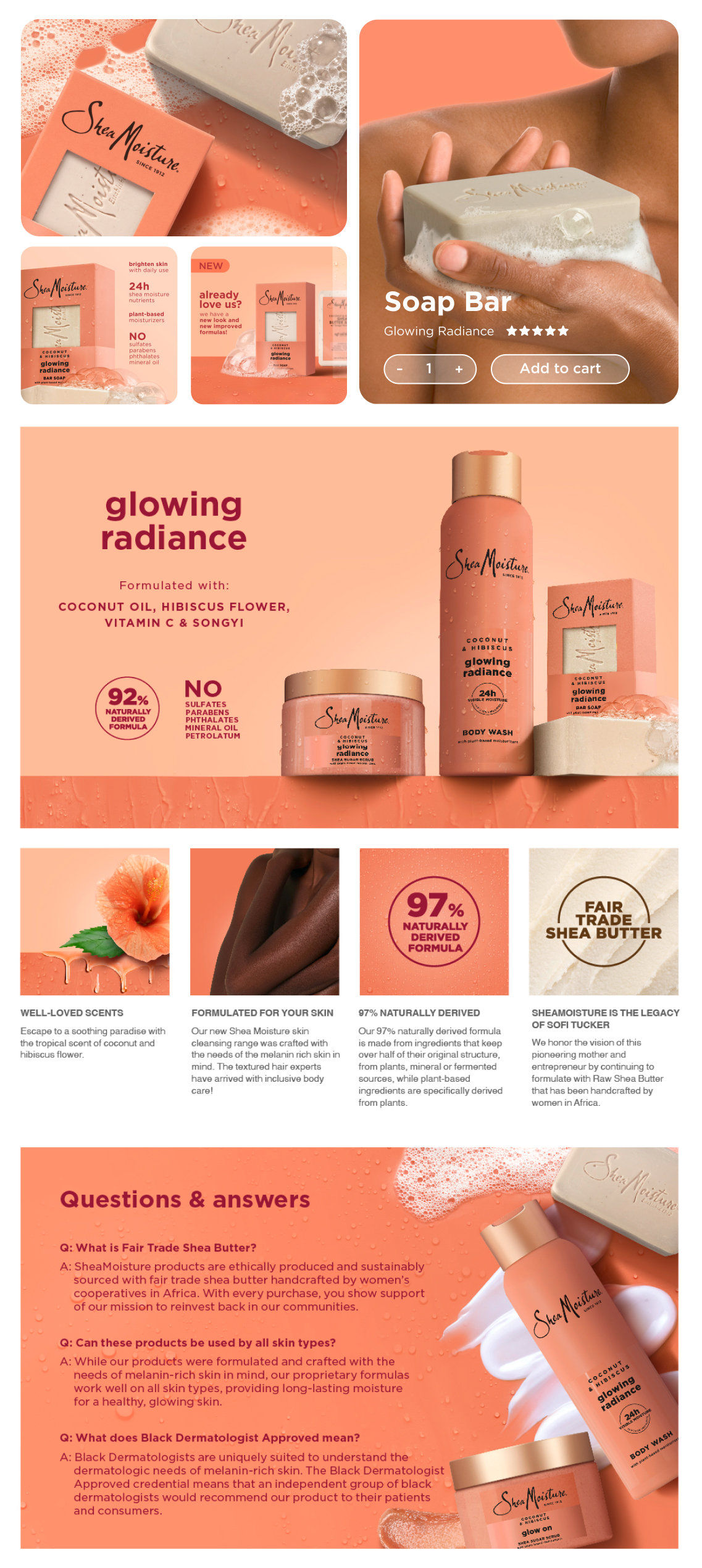
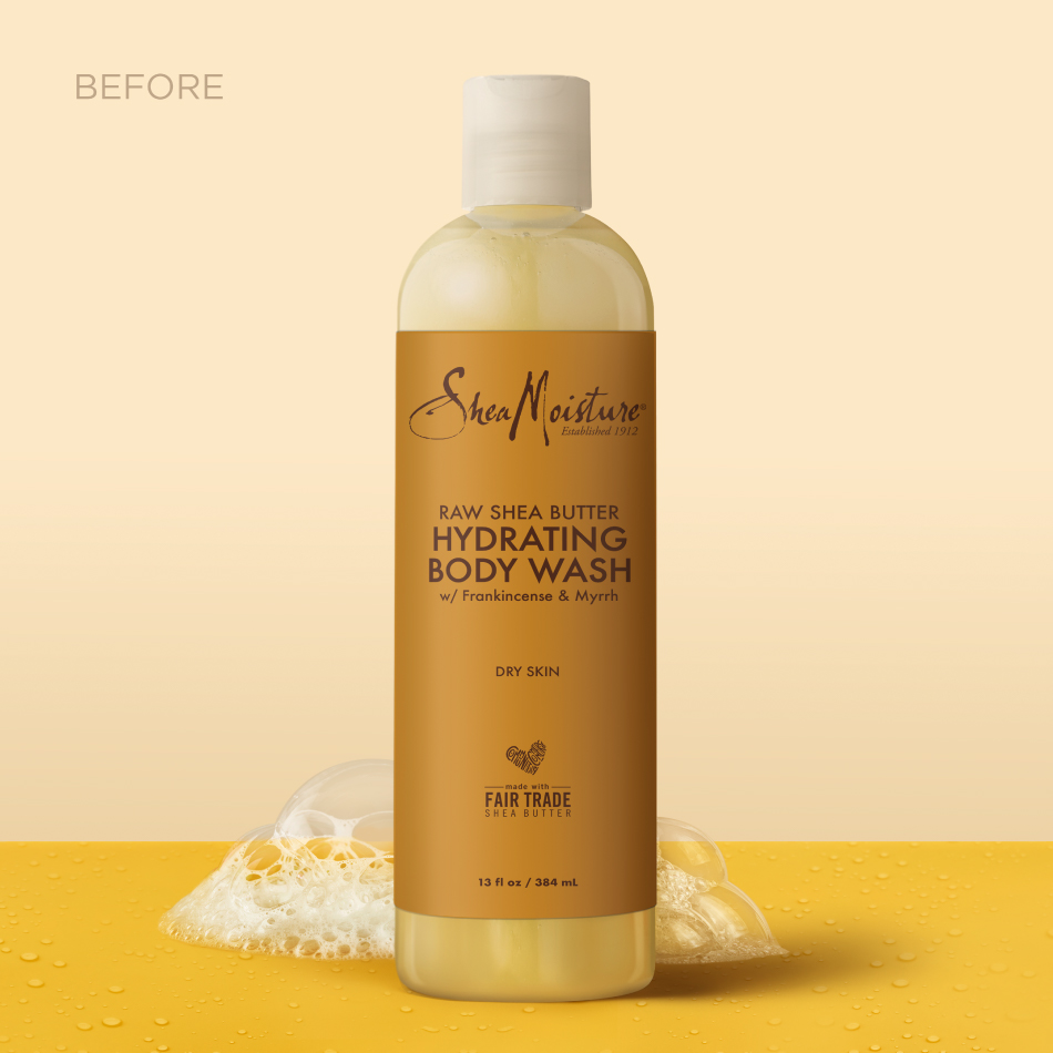
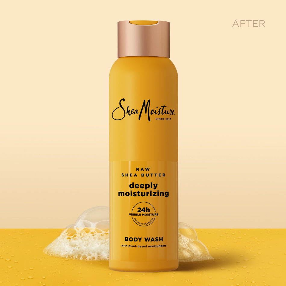
When less
is more
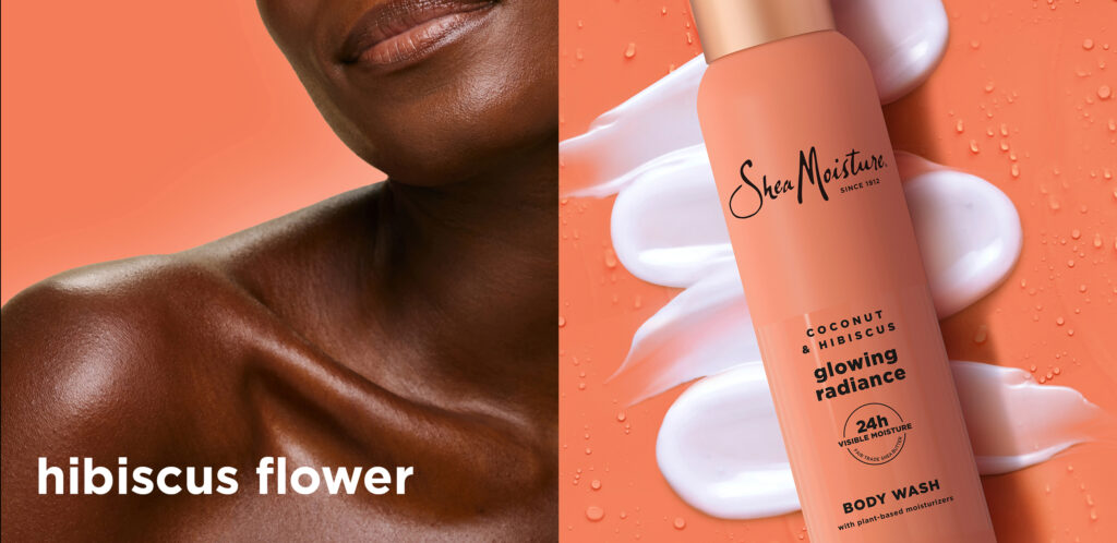
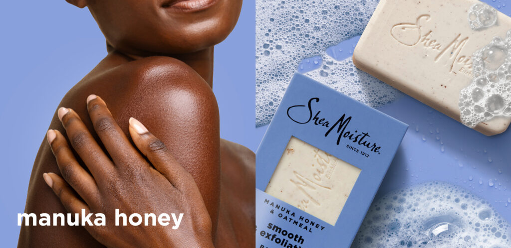
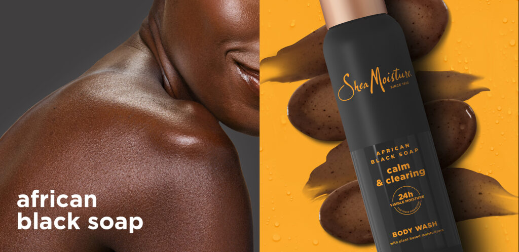
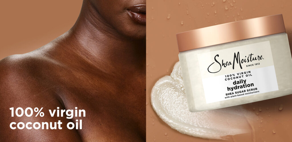
The challenge was to redesign and elevate the packaging for Shea Moisture while staying true to the brand’s roots. To do so, we proposed a soft touch opaque bottle combined with a glossy finish and a golden cap for the body washes. For the bar soaps, we chose a carboard packaging with a die-cut window to reveal their fragrance and texture. We also redefined the messaging hierarchy on the front of packs, highlighting the benefits and proven effects without losing the plant-based heritage messages.
The visual
evolution
Building on this foundation, and based on the brand’s colour palette, we redesigned the product’s packaging to create a more cohesive and premium look.
Move the slider to see the evolution.
From packs
to visuals
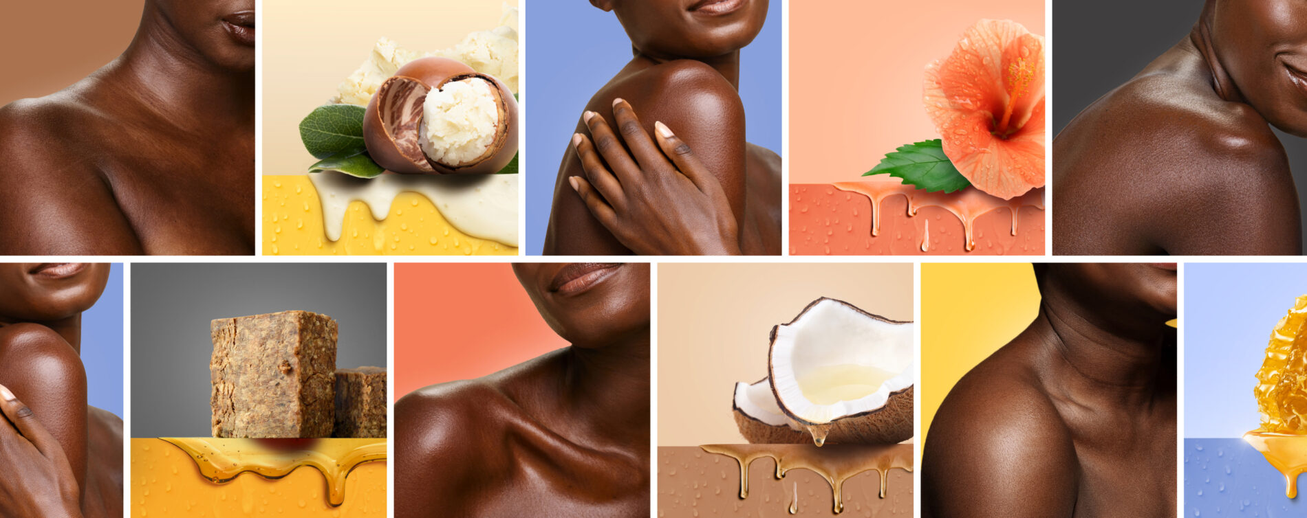
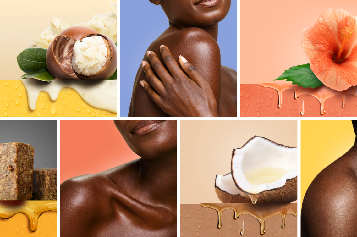
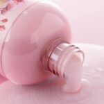
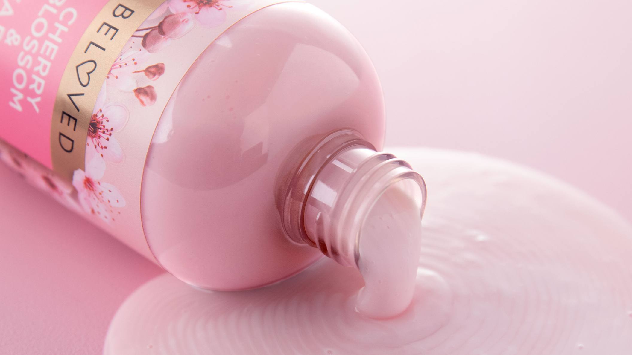
Once the packaging designs for the skin cleansing range were finalized, we created visual graphics for digital media, along with an e-commerce video to showcase Shea Moisture’s products online. All imagery was produced in-house using 3D and computer-generated techniques—no photoshoots, just creativity and hard work.