Tradition
has a sweet tooth
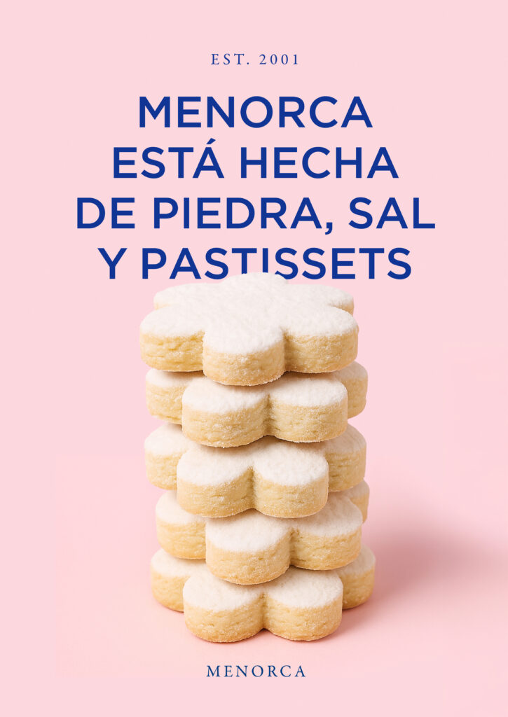
Herbera is a family-run bakery located in Ciutadella, Menorca. Established in 2001, it represents the 4th generation of master bakers on the island. While embracing their origins, Herbera sought to redefine and refresh their identity, elevating the brand and ensuring consistency across all touchpoints.
- COPYWRITING
- Packaging
- Rebranding
- Stationary Design
- Strategy


Coated with
a sophisticated glaze
Herbera’s vision was to give the brand a high-end look inspired by French patisseries. To achieve this, we curated a new brand identity and brand manual that brought their vision to life without compromising their heritage and essence.


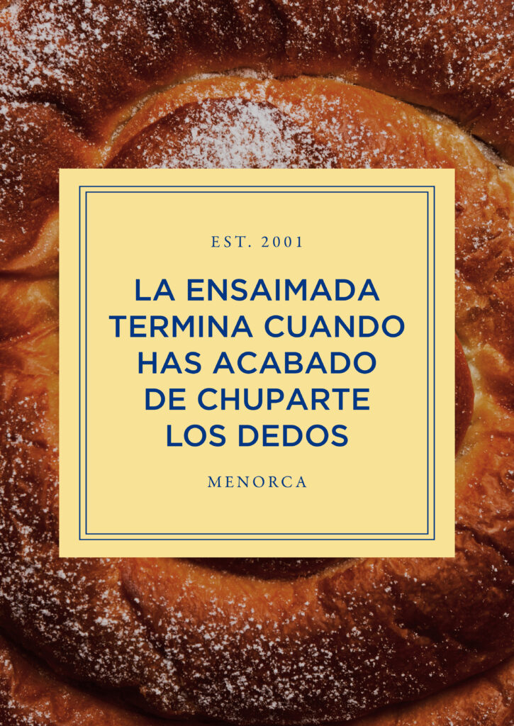
A taste of Menorca
in every bite
We designed a new logo with a custom typeface, a new tagline, a multichromatic palette—based on blue and white softened with pastel tones—along with detailed, easily recognizable packaging. Playful messages, appear across signature packaging, signage, and stationery, capturing the laid-back lifestyle of Menorca.
Treats with
a special treatment
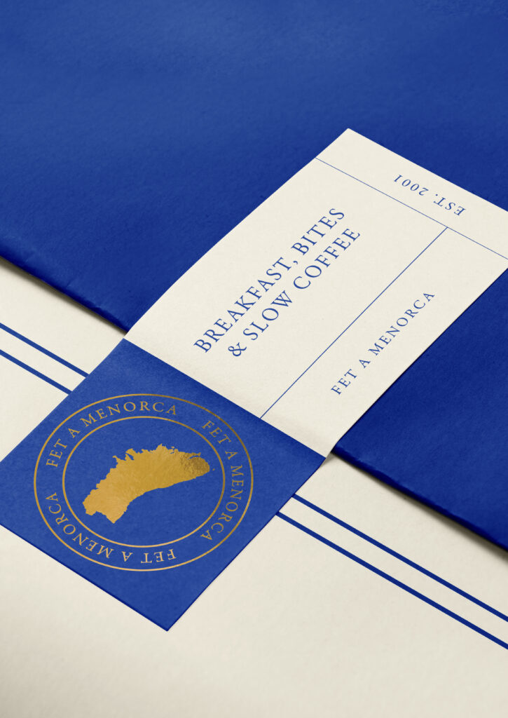
To accentuate Herbera’s strong ties to Menorca and add a premium touch, we also created a custom stamp that reads “Fet a Menorca” (Made in Menorca). This signature detail is featured on the packaging and a series of postcards we designed for people to take home as gifts.
Same recipe
across all touchpoints
When rebranding, it’s essential to visualise everything beforehand to craft an identity that is cohesive and recognisable. For Herbera, as with any client, we carefully considered every detail: color usage, packaging elements, how fonts appear on materials, the choice of imagery and the reasoning behind it and, above all, the visual impact that each decision entails.
At the end of the day, good branding is like a recipe: change the ingredients or measurments, and you can end up with an entirely different result.